Friday, 12 April 2013

Evaluation 7

Looking back at your preliminary task, what do you feel you have learnt in the progression from it to the full magazine?


Preliminary task front page 
                                                                   Preliminary task content page 


 Here what you see is my preliminary task, considering this task  
my skills using Photoshop has improved dramatically  in many aspects. This was beneficial to me as I learnt even more from it and made things even better for example the images and text.  Comparing my preliminary task and my final magazine cover you can see a huge difference, this is because of the genre they have been created for. The preliminary task is a school magazine and the other is a teen pop music magazine. In my  preliminary task the pictures were all taken from a good professional camera to create that high class effect and I kept that the same for my main magazine pictures as well by using  high standard equipments. The colours that I have used in my preliminary task go very well in my opinion as they are very subtle and look rich in colour, as the colours are all picked out to bring out the picture and the text. The font is also all the same instead of using different sizes of font that is why I think the  school magazine has turned out to look more professional. 

Creating the preliminary task I have learnt that every genre has its own style this includes images, fonts and colours as for the school magazine I have used colours, images and fonts to make it look professional but for my own  teen pop music magazine I have used completely different things. The best possible way of doing this was to research to enable the best possible outcome of my magazine. I looked at magazines such as 'Top of the Pops' and 'I heart pop' , due to this research i was able to find my successful elements needed to make a teen pop magazine. From the research I found my main magazine 'Top of the Pop' to be targeted at 9 - 15 year olds and this is why I chose to keep the same age group audience for my magazine.  After the age group had been decided I started researching about what kinds of stars were most popular amongst the young teens, what they liked and what they preferred, This was all done by a form of questionnaire. (questionnaire page 3) This was an important part of the research as it would let me decide what I should add in my front cover to attract my audience.


Final front cover                                                     Final content page

This was the final out come of my magazine. From making this teen pop magazine I have learned and developed my skills of using the right things for different genre of magazines from professional looking magazine to a teen pop. Using the help of Photoshop which I have taken complete advantage of by using it for its best tools and coming out with what looks like a real pop magazine. My knowledge in the music magazine industry has also increased by looking at various magazines and analyzing its covers and making consumption of why an image is placed there or why something is written. From making my own magazine i can confidently say that next time it would be even better and from making this magazine I have learned and acknowledged the mistakes i have made. If i could change anything I would change the content page as it looks a bit too crowded and for my front cover I would add more interesting colours that would reach out to my audience more but as for my double page spread i would keep it just as it is. Acknowledging my trials and errors I have learned whats good and whats not and also learned skills of using Photoshop  High tech cameras and many other technological products to get the best results possible. 


Evaluation 6

What have you learnt about technologies from the process of constructing this product?

In the process of creating my own music magazine I used the editing software Adobe Photoshop CS5.1,  Photoshop as the key thing to the making of my own music magazine this is because everything had to be edited from photos to text. From the process of constructing this product I have not only learnt about technology but also different kinds of devises for example a professional camera to a professorial flash smoothing device which is called a octabox. Having no idea of how to use Photoshop I think I have learnt new techniques and styles to reach the highest standard of of my magazine. 


 Here is a screen shot of my content page in the process of making. From Photoshop I have learnt that the more you use it the more techniques you are able to learn and instead of asking someone for help its better to experiment everything to find out what it does and how you could use it and that is how I mostly found out.

As you can see in my double page spread my skills in Photoshop has improved highly as the effects are a lot different and better than my front page and my content page. All of the pictures in the whole of my magazine are taken with a professional canon digital camera making the photographs look so much better than taking it with a smart phone. As you can see on the right  the quality of the main picture is very clear and bright this is because of the octabox making the model have flawless skin giving her a healthy glow.

Evaluation 5

How did you attract/address your audience?

There was many ways in which I attracted my audience. First of all what I did was, I formed a questionnaire for my target audience where I asked them various questions such as Who is your favorite artist? What gender they are, how much they are willing to pay for a music magazine and many more. ( Questionnaire results page 3). This was a very important part of the making of the magazine because we needed to know what audience wanted. From the questionnaire one thing that I found out was that young teens liked One Direction more than any of the other artists this is why i decided to add a picture of young 5 attractive boys,
as shown on the bottom of the magazine is where I placed the image and gave them the name Destination, One Direction? what direction, where are they going? To a destination! that is how the idea came.

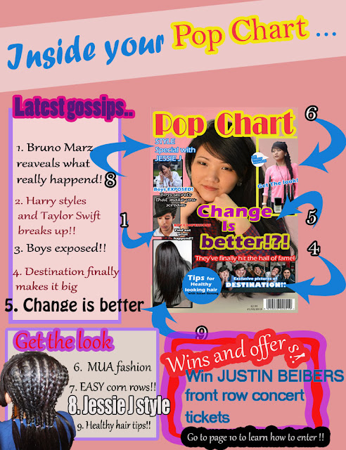
As shown in my Questionnaire results (Questionnaire results page 3)  90% of my audience are all female, and to attract the female audience I decided to add some hair and beauty things for example on the bottom left hand corner you can see there is an image of  healthy looking hair, and on the top right hand corner there is an image and tagline saying `Get the look' this will attract the female audience mostly because its targeted towards the female gender.

To attract my audience that are mostly all female I used feminine colours and Bold colours too. The background of this magazine cover is light coral, I chose this colour because its very feminine and also because it's in fashion at the moment, I chose colours like red, blue and yellow to bring out the writings and the images more not just the main image but the taglines and the smaller images on the side. The fonts are all different in size and fonts because its a pop magazine it should be a little different and eyecatching this is why I have used more than 5 fonts all in different sizes to attract the audience and make easier to read. The main image attracts the audience as its a young beautiful model, natural looking and the main tagline `Change is Better' would want them to read about it.

This is the content page for my magazine as you can see it is layed out similarly like my researched magazine `Top of the Pops'. my content page does not have a editors message because out of all the `Top of the Pops' magazine I researched, I found only one editors letter that is why i decided not to have a editors letter but instead add more pictures and a chance to win concert tickets for the audience.

Evaluation 4

Who would be the audience for your magazine?

The audience  for my music magazine is 9-15 year olds, however teenagers from all ages are enjoying the latest pop music which might be beneficial for me as it would raise the number of copies selling and also raise the age group from 15 to a higher number. The income that target audience gets reflects hugely on my buyers as they are students meaning the C category being an unemployed student. My audience will mostly be girls that is why there is hair, makeup and also clothing mostly all for females.


I have added a picture of Selena Gomez of the top and Cher Lloyd on the bottom as I believe both of these female artist are representing my subculture very well. Teen pop copies genres and styles such as pop, dance, R&B, hip pop, country and rock. Selena Gomez recently came out with a single that has a hint of Indian music, she has worked into it very well making it sound pop and Indian in a certain way, I see this as the same sub culture as mine because teen pop has many styles so this aswell can be accepted as a new and a fresher idea. On the other hand is Cher Lloyd who is a young female singer and also a rapper, after shocking people with her talent in the UK, she has moved to the US and has been a big hit till now. This shows us that pop and rap can also be bought together with hard word and effort, I think my magazine would be successful when aimed at a age group who has accepted all of these factors and hoping they could be inspired by it. 

Evaluation 3

What kind of media institution might distribute your magazine and why?

The main media institution that I looked at when doing my research of teen pop magazines showed me the main ones i came across which was BBC distributing `Top of the Pops' magazine and Egmont which distributed `We love Pop' magazine. In the following files below there is a print screened images of the website Egmont and We love pop magazine website. Disappointingly the Top of the Pops magazine does not have a updated magazine website which could have been very helpful to me.   


Egmont would be interested in distributing my music magazine due to to them having the very popular teen pop magazine `We love Pop'. It has a similar liking to my on magazine which is bright colours, famous young celebrities and also the latest gossips. As you can see in the pictures below that `We love Pop' magazine and
my chosen magazine `Top of the Pops' they both look very similar in style for example the use of colour, text, pictures and even advertisement is similar. Following through my magazine Top of the Pops and being inspired by it i created my own magazine hich i feel would fit in well along side these teen magazine. However due to them having two magazines in the same genre may not consider distributing my magazine as it would all most be like distributing two of the same magazine. Besides how it look my magazine would have different kinds of elements to to that might interest different readers, this is why I think Egmont would distribute my music magazine as both magazine would be similar in some ways in different in other ways which would gain them more readers and buyers. 

Evaluation 2

How does your Magazine represent a particular social group? 


I have chosen to represent the teen pop subculture, Teen pop is  a sub-genre of pop music. It is targeted mostly  towards preteens and teenagers widespread across various countries. Teen pop copies genre and styles such as  pop, dance, R&B, hip Pop, country and rock.  
Teen pop music include lyrics focused on teenage issues such as love/relationship, friendship, fitting in and etc. Teen pop also emphasis's on visual appeal meaning photogenic faces, body physiques and attended hair and designer clothes, as you can see in this picture they can all be seen very clearly as all of the young boys are all emphasized on their visual appeal from head to toe.  As you can see in the photograph the young boys are wearing bright seasonal coloured clothing this is to attract the young generation, they are a band called One Direction  to not make any of the members feel outcasted they are all wearing similar clothing and light makeup hide any imperfections.

In this video you can see Justin Beiber representing my subculture, the song lyrics and clothing  signifies that he is a teen pop artist. In the second video you can see One Direction singing and dancing wearing casual but fashionable clothing and the synchronised dance moves are representing my subculture.


In both of these videos we can see similar things such as the the singer on the first video and the singers on the second video being young and attractive, they are all wearing clothing that is in fashion or was in fashion, the background dancers or actors are also young just like them and the dance moves are synchronised, the lyrics are about teen issues meaning teen pop culture.

 In my magazine I have tried to place all of the things above for example the model for my magazine is a young attractive looking teen, she is wearing something that has a good contract to her skin tone and as well as in fashion and last but not least the taglines and stories are what interests the young audience and what they can relate to. 
Basing around that idea I have used light makeup on my model to show that she is not all fake and shown her natural beauty. The coverlines of my magazine are all related to young attractive males and females. I have created a magazine which would be appealing to the my audience considering their age. 


Evaluation 1

In what ways does your magazine use, develop or challenge forms and conventions of real magazines?

Researching into different genre of magazines I came across many magazines from punk rock to country, looking through  the most popular magazines to not so popular ones, I picked out one magazine which i generally had some interest in which is `Top of the Pops'. Top of the pops is a teen pop magazine with a age group of 11-15 year old with 85% of the readers being girls and the 15% boys. I've had interest in this magazine from an early age because it was appropriate for me at that age and i could also see new stories and information about my favorite singers and boy bands. Not much has changed over the few years aside from the celebrities and the stories.


As you can see on the left hand side it is an image of `Top of the Pops' magazine and on the right hand side  I have placed my own pop magazine. As shown in this picture `Top of the Pops' has featured a popular male celebrity for the front cover which from that we can tell the audience targeted is mainly girls. On the right hand side of the image we can see that there is nail polish and eye shadow which automatically targets the female audience whist adding the girly feel to this magazine, This what I see as a positive aspect of this magazine.

In `Top of the Pops' magazine there are images taken in different techniques  for example the three images on the left are extreme closeups of celebrities with cover lines next to it. I have also tried doing something similar by taking close up pictures of my model or cropped or zoomed in to create that similar effect. One convention that I challenged myself was instead of using a  male  model for my magazine I decided to use a young female model, but I don't think it makes much of a difference for  gender in this particular magazine as its accepted by both genders. As you can tell I have taken the basic idea of where to place the images from the original magazine, this is because I wanted to have the most realistic effect. The one thing that I liked very much was the blue circle on the bottom left hand side, I have used that idea but changed few bits for example the font ans the size of the circle, I've made sure to use exactly the same colour and for this I have used the eyedropper tool in Photoshop. If you look closely my model has very neutral smokey eye and has light makeup on, this is to create that young glowing skin effect for example if this was a RnB music magazine aimed for 17-30 the makeup would be a lot darker in the eye area to create bold, sexy look as it would be aimed for that certain age group. 

Thursday, 11 April 2013

Double Spread


Content page


Front page magazine cover


Draft front page


This is my draft front page and also my plan. This is how I want my front page to look like with similar colours shown on the page. Where the purple boxes are places that is where I want my pictures to go along with small taglines like shown in the draft. From looking at my draft front page I know exactly what to change and how I should make it better, for example the title will have to be changed in many ways such as the colour because its not eye catching as the yellow colour looks faded away and dull, another reason is the name it does not suit the main image as the model is not a girl but a teenager and the last thing with the title is the position. Changing all of these factors will ensure that the colour would be more eye catching and visible and it would fit all the age group appropriately. I am going to change the name of my magazine to `Pop chart' this is because the name has to be suitable for the age group and also the magazine.

From looking at this draft I can tell that the taglines look dull and not exciting at all this is why I will have more exciting stories taglines and also pictures of the hottest new boy bands which from my questioner I found that One Direction is more popular among teenagers.
The colour of the coverlines will also have to change into more exciting bold colours like the colours in my colour palette, this will make it easier for my target audience to  read and understand.

Sunday, 24 March 2013

Final image


This the final image that I have decided to use for my teen pop music magazine cover. This fits my genre of music very well as the costume, makeup, hair and lighting is done on a appropriate level and also the model herself is the right age group. As you can see the eye makeup on the model is very light smokey eye and also the hair is left natural with a bit of teasing to create extra volume, this has been done to show the natural young side    
rather than using heavy makeup and costumes if it was a different genre magazine for example rock. 

On top of this picture there will be different coloured texts and pictures but to not blend away the main image the eyes are in clear focus this is to attract the audience and will be made even brighter and edited with effects to enhance the image and the background colour will be changed into the colour palate of my choice to fit my genre of music magazine.

Thursday, 21 March 2013

Creating the front cover


Title

Pop Girl
   -This is one of the possible name for my own pop magazine cover,  I think this would be a possible title as 
 its a catchy phrase and would be able to attract audience more effectively. The name `pop' would of course show the genre of the music magazine and `girl' would be the targeted audience.

Pop Chart
  - This would be a good name for my music magazine as it does not separate the girl and boys audience as not all the hole of my targeted audience is all girls. Th name pop again shows the genre of the music magazine.

Pop Heart 
  - This is the last possible name for my music magazine, I  have chosen this because of the the girly sound to it as it has pop `heart' word which you would probably find in a girls magazine for example 'We heart Pop'. 


Coverline

`Boy secrets'
  - This would be a good coverline for my magazine as it would attract the main targeted female audience.

`Gossips' 
  - This would interest all my male and female audience because and as it's catchy and they would want to read more about it. 

`Exclusive pictures of destination'
  - This would grasp the attention of my audience as it's not just a topic to read but to see pictures of a new popular band


Main coverline

`Change is better'
  -This coverline would make readers want to read more bout it as it would be placed right in front of a attractive picture of my model. 

`In my life'
  -This could be a main coverline for my own music magazine, it could interest the audience wanting to know more about a celebrities life style. 


Price

£1.00
- This price would be a good price for my targeted audience as they are all unemployed students, but to be fair for my own good of the magazine the price would have to go up to gain a certain amount of profit as well. 

£2.99 
- This is the original price for my researched teen magazine `Top of the Pops' This would be a suitable price as its not too high and not too low. 


Images


 This image could be suitable for my teen pop magazine because the  
 model is a young teen herself, but the picture does look very dark
 which could be a problem because teen pop stars are always 
 shown to be have the most flawless  bright young skin. The make up 
 on this picture also looks a bit dramatic in the eye area which may be     
 a problem because it would make young teenagers want to wear  
 heavy makeup. 
 This image is a good contrast of the all the important things needed for  
 teen pop magazine as it has a young attractive model who looks very  
 natural and the lighting is also a lot better but the most important thing 
 in this photograph is that the eyes are very in focus this is to attract the  
 audience. 

 This picture is could be a possible front cover for my magazine as it looks interactive but could may be a problem as the eyes are looking somewhere else and not catching the attention of the audience.

This is the last picture and is also my favorite because everything in this photograph is perfect for a teen magazine for example the light makeup, the natural hair, the young attractive model, lighting, clothing and also the eyes that are in focus, These factors would bring in the audience and would give my magazine a teen pop feel to it. 

Wednesday, 6 March 2013

Questionare results

Colour Palette


This is the colour palette for my own teen pop magazine. I have chosen this particular colours because this colours is mostly known as feminine colours along with pink and from a certain age for example 7-13 year old girls would like the colour pink a lot and from a certain age growing up they would prefer a bit darker colour or even a completely different colour. This is my  choice of colour; I think this colour would be perfect and would fit my magazine and also fit the age group very well as it is quite a girly and a feminine colour and is also a colour that’s in trend. I think it’s important for the colour to be in trend or a colour people would like because the magazine is made for the audience, it’s important to keep track of what the audience want and what they do not. In my opinion this can have a huge difference on how well the magazine will sell.

This is also my chosen colours, this is particularly for my fonts and outiles that i may need in my magazine. I have chosen these bright bold colours because the background would be a light soft colour and with main picture and small pictures along side if i use fonts and outlines woth these colours it would be easier for the readers to see. In my opinion these colours will do well for my magazine because they are all what u see as pop of colour and because this is a magazine for for teenagers it would perfectly fit.


Analysing the front page, content page and editors letter

Thursday, 7 February 2013

Top of the pops magazine presentation


Target audince

Ideas for front cover

Ideas for front cover


I’ve looked at a wide range of magazines and from that I can say that the most selling pop magazine is for a particular teenage group. The magazine I am most interested is `Top of the Pops’ which is a magazine with its audience mostly girls from ages 9-16. For my own magazine I would have the same aged group audience of the same gender which is females. For my front cover I would like to use a young attractive boy or a girl  for the front cover because it is a magazine with a large female audience. ‘Top of the Pops’ has a contemporary artist and who the audience admire for example the last magazine had Justin Beiber on it. The writing of the magazine will be bright bold colours this is because it is a fun and entertaining magazine instead of a serious business which would have dark coloured same size fonts. The font i will be using will be  Eras Bold ITC, this is because i think the font itself is perfect for any magazine as the look of this writing changes with with the size you choose and it would be fun to play around with it to get the right effect i want for my magazine front cover.

First idea